Every year Google updates their algorithm 100’s of times. Last year there were over 500 updates. Yes, many of them are simple data refreshes, but there were also quite a few significant algorithm updates. You might be familiar with some of the bigger ones over the last few years, such as Panda, Penguin and Pigeon. So, what’s next?

Enter the Mobile-Friendly Algorithm Update
There is no official name for this algorithm update yet, so marketers are calling it the “mobile-friendly” update. Hopefully they won’t taint the name of another cute, small animal that starts with a “P” (what could it be the Piggy update? Pheasant? Pale Fox? I digress…). Google did announce the specific date, however, so we can confirm that it will begin rolling out on April 21st, 2015.
So, what is going to happen come April 21st?
I am not a psychic, so please know that some of this is speculation since the update is yet to roll out. However, I have done quite a bit of research on the subject, so this post is an attempt to bring you real information collected from the online marketing community.
It appears this update is going to impact:
- Mobile App Indexablility and Rankability in Mobile Search
- The Rankability of Websites with a Mobile App Available
- Website Rankings on Mobile Search
Since most of the questions I get from our clients are related to their website’s ability to rank and how they will be impacted by this algorithm update, that is where I am going to focus. If you are more technical and want to read more about the subject, I highly suggest this post on the Moz Community blog from Cindy Krum: 9 Things You Need to Know About Google’s Mobile-Friendly Update.
Your Mobile Website Questions Answered
Is mobile search really that big?
Many online marketers were predicting mobile search would overtake desktop search by the year 2014 and they were right. A recent report from comScore shows mobile search actually overtook desktop within the last year:
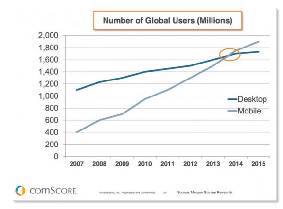
This means that there is a good chance that a lot of your website traffic is coming from mobile search. In our client pool we see anywhere from 30%-60% of total web traffic is coming from mobile queries on average, sometimes more.
Other Mobile Stats:
- 80% of internet users own a smartphone
- Popular devices used to search the internet:
- Desktop/Laptop: 91%
- Smartphone: 80%
- Tablet: 47%
- Game Consoles: 37%
- Smart TV’s: 34%
- 40% of mobile searches are local
- 81% of mobile conversions happen within 5 hours of the search
- 85% of mobile users prefer to use an app over a website
Do I need a mobile or responsive website?
YES! Did you read the statistics above? Mobile search has already taken over desktop search and the numbers will only continue to increase this year. More and more people are using their mobile devices to search and buy, so if your website isn’t mobile-friendly you are overlooking an important part of your user experience.
Also, come April 21st there is a good chance your website will lose its ability to rank well in the mobile search results. Why? Because Google wants to serve their mobile users the sites that are formatted well for mobile devices. Google is always aiming to provide it’s users with the best websites and information available. They understand that users are going to be frustrated with the results of their query if they land on pages that aren’t mobile-friendly. How frustrated are you when you search for something from your phone and the result you click on produces itty-bitty content that is impossible to read? Or navigation you can’t even click on? No thank you.
What is the difference between a mobile website and a responsive website?
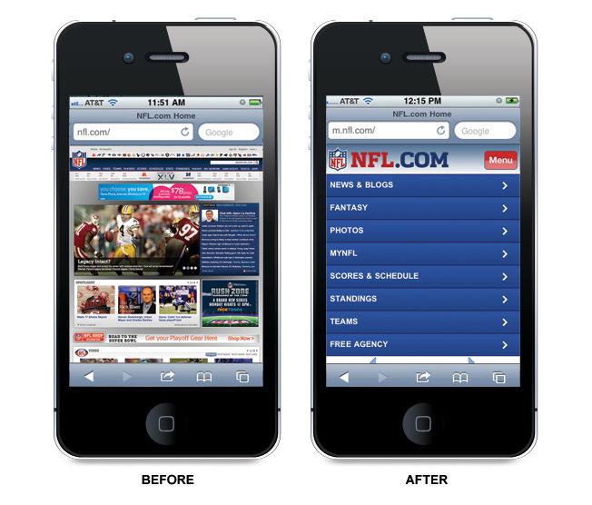
When mobile search first started to become popular, many website owners and website designers/developers believed you needed a separate mobile site or landing page. This resulted in thousands of sub-domain sites (think m.yourdomain.com) and standalone mobile pages, designed specifically for use on smartphones.
Typically a mobile site is a scaled back version of the desktop website, which can include limited content, images and pages. It also is coded so that anytime a smartphone user visits your website the code will recognize the device and provide them with the mobile version automatically.
A responsive design is a website developed to scale to any size and type of device – desktop, tablet or mobile phone. Unlike mobile sites, it’s NOT a separate site, but rather a code that adjusts the design to fit the screen dimensions of the browsing device:

All things considered, a responsive site is a better solution long term than a mobile site. Why? For starters, a responsive design is better for SEO. Mobile sites are developed on sub-domains and responsive sites host mobile code on a single domain.
Another huge added value is the consistency it provides to your user experience. If I visit your website from my desktop and later I decide to visit your website from my smartphone, I want to see the same information. If you hide information from me because I am on my phone, I am going to become frustrated. A responsive design ensures that repeat visitors can access all of the content and information your site has to offer, regardless of which device they are searching from.
How do I know if my site is mobile-friendly?
There are actually quite a few free tools on the market that will check for mobile or responsive design and even show you a preview of your site, per device. I’ve used http://www.responsinator.com/ but it isn’t perfect and only gives you a preview – it doesn’t give you any real data:

Instead, Google rolled out a new Mobile-Friendly testing tool, which will analyze a URL and give you a report back on if that page has a mobile-friendly design:

Keep in mind, however, this is just a tool and therefore doesn’t replace the need to manually review your site to ensure the user experience is the very best it can be. I always advise clients to also Google their site from their smartphones if they want to see what a user sees. Naturally each type of phone is slightly different, so if you want to really evaluate your site design manually, ask a friend with a different device to look it up for you – be sure to check your site on an iPhone AND an Android device.
It’s also important to note that there are other tools you should also use to determine how mobile-friendly your website is. The Google mobile-friendly tool above gives you a “yes” or “no” and a quick screenshot of your site as Google sees it on a mobile phone:

They also give you specific recommendations for areas you should fix to make your site mobile-friendly.
But, you should also use these two other tools if you really want to know how mobile ready your site is:
Google’s PageSpeed Insights Test Tool – This tool gives you insights into your website loading times, including your mobile page speed. It also gives you other recommendations on things you should fix. You should note that unlike the mobile-friendly tool which looks at the page like a Googlebot would, the PageSpeed tool fetches the page as a user would. Very different, which is why you should use both tools.
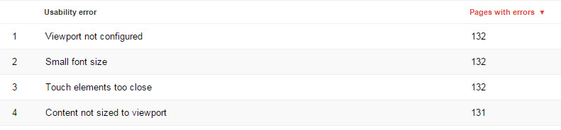
Lastly, you should also use the Mobile Usability Report option in your Google Webmaster Tools account. Simply log in and navigate to the Mobile Usability Report. Once you run the report you will be provided with specific details on which pages are pulling a usability error. Example:
Google has also been sending out notifications through Google Webmaster Tools to sites that don’t meet the new mobile-friendly requirements. If you haven’t received an email you likely have a mobile-friendly site. However, you can confirm by checking your messages in Webmaster Tools.
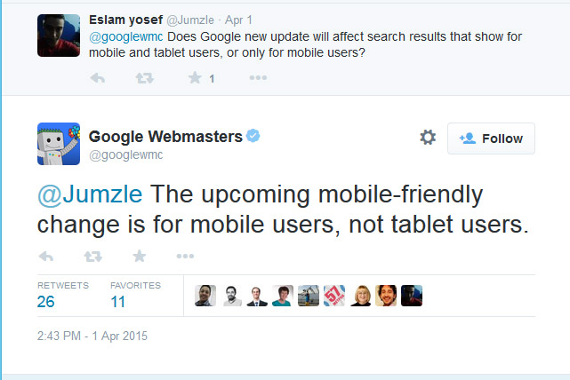
Do tablets count as mobile devices?
No. Surprised? I was at first too. However, according to this post on Search Engine Round Table by Barry Schwartz: Google Mobile-Friendly Algorithm Will Not Impact Tablet Searches “the algorithm will only impact searches done on smartphones – only. This does not impact desktop searches and it does not impact tablet searches.”
This is good to know, but doesn’t change the fact that a significant amount of search traffic is coming from smartphones specifically. So, the potential loss in traffic is still significant.
Will I lose traffic on April 21st if my site isn’t mobile-friendly?
Yes. Unlike other major algorithm updates, Google has actually provided the public with an advanced warning on this one, giving you plenty of time to fix your site:
“Starting April 21, we will be expanding our use of mobile-friendliness as a ranking signal. This change will affect mobile searches in all languages worldwide and will have a significant impact in our search results. Consequently, users will find it easier to get relevant, high quality search results that are optimized for their devices.”
You can read the full official announcement from Google here.
To be clear – this is specific to mobile search. So, if you have great keyword rankings and traffic from desktop searches, those should NOT be impacted at this time. However, as mentioned above, if you are getting 30% or more of your traffic from mobile search queries (which is typical) than if your site is not mobile-friendly, you WILL DEFINITELY LOSE TRAFFIC.
The Nutshell
If your website isn’t mobile-friendly you will likely lose a significant amount of traffic come April 21st. Even if that number is low right now, keep in mind that mobile search is still on the rise and will only continue to grow over the next few years. If you own a website and you are planning for the future, now is the time to integrate a solid strategy for creating a great mobile experience for your site users.
If you need help developing a mobile website and marketing strategy, give us a call: 800.871.4130.


It is going to be one of the biggest algorithm shifts of Google and will be very interesting to see how it reacts. I believe that websites should be prepared much before than 21st April so that Google gets enough time to re-crawl and re-index the sites/pages before the algorithm change happens.
Thanks for this post, really good one.